Appearance
Layout
Each experience has a customizable visual layout that controls how it looks when a user opens it. You can set a hero image, choose colors, and adjust display options to match your brand.
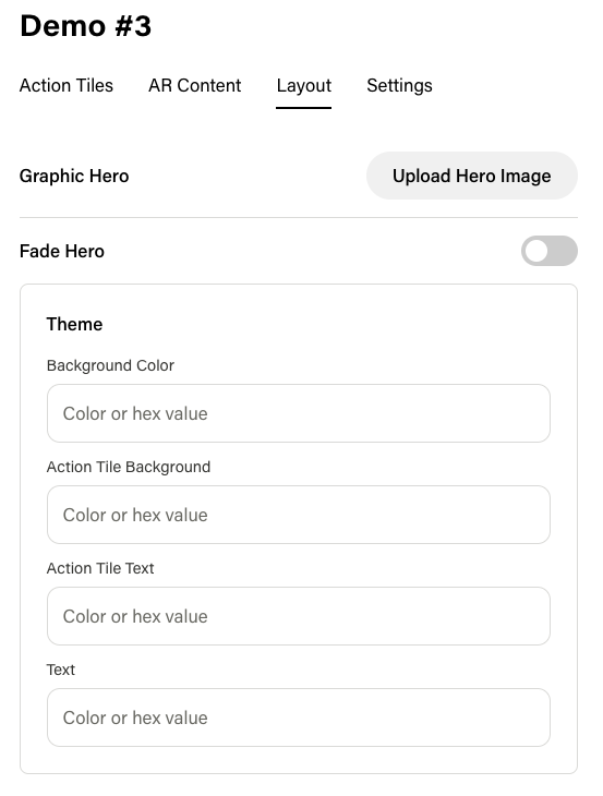
Hero Image
The hero image is the large visual at the top of the experience. Configure it in the Layout tab of the experience editor.
| Setting | Description |
|---|---|
| Hero Image | Upload an image at 1800 x 1200 px for best results. |
| Fade Effect | Toggle a fade effect on the hero image for a softer transition into the Action Tile list. |
Theme Colors
The theme controls the color scheme of the entire experience. You can customize:
| Color | What It Affects |
|---|---|
| Background Color | The main background of the experience. |
| Action Tile Background Color | The background color of each Action Tile. |
| Action Tile Text Color | The text color on Action Tiles. |
| Text Color | The general text color used throughout the experience. |
These colors are stored as part of the experience's theme and apply globally to the experience layout.
Tips
- Use high-contrast colors between Action Tile backgrounds and Action Tile text for readability.
- The hero image is the first thing users see — choose something visually striking that represents the experience.
- If using a dark background color, consider lighter Action Tile and text colors for a clean look.
- The fade effect works well with graphic hero types to blend the hero into the content below.